Understand IETF RFC 5646 language tagging significance – a structured system revolutionizing web language identification enhancing accessibility, SEO and user-experience.
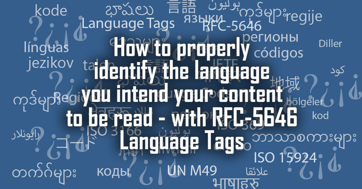
Understand IETF RFC 5646 language tagging significance – a structured system revolutionizing web language identification enhancing accessibility, SEO and user-experience.
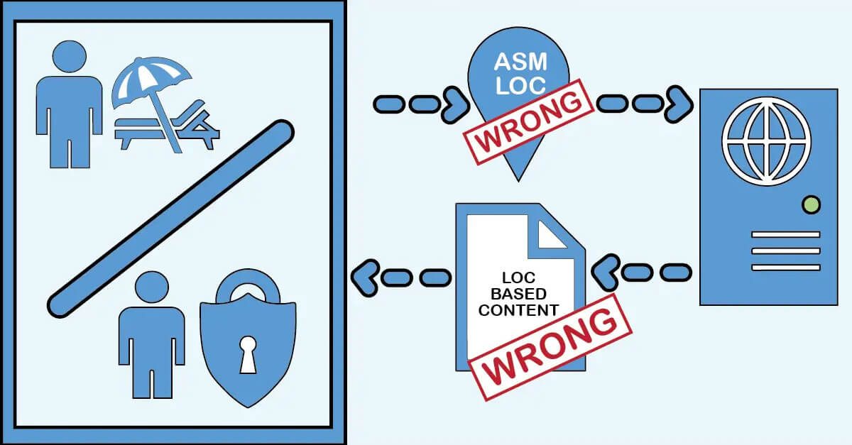
It’s not uncommon for clients to express a desire to utilize personalization techniques to dynamically alter the language or content of a webpage based on the user’s detected location. In this article though we explore why that is not ideal and what we should be telling our clients to do instead.
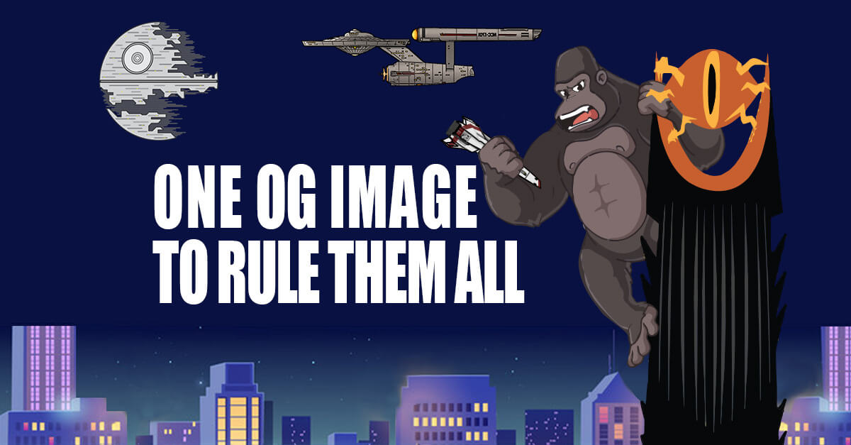
For almost a decade now I have followed Garrett Heath’s advice on formatting social media images but maybe it is time for a change. In this article I go over my own testing and conclusions on resolution sizes and ratios to use for OG Images.
In 2015 I wrote an article for my team inside the company I was working at but I felt like it was so useful that I decided to post it for all. The topic being about how designers trying to solve for long scrolling actually hurts the mobile experience.
In 2015 I wrote an article for my team inside the company I was working at but I felt like it was so useful that I decided to post it for all. The topic being about how fonts for the web and really if we can even use the term web safe font anymore.