The viral 8 ÷ 2(2+2) debate is not about bad math. It is about ambiguous notation, implied multiplication, PEMDAS, and why math has grammar to sort this out.
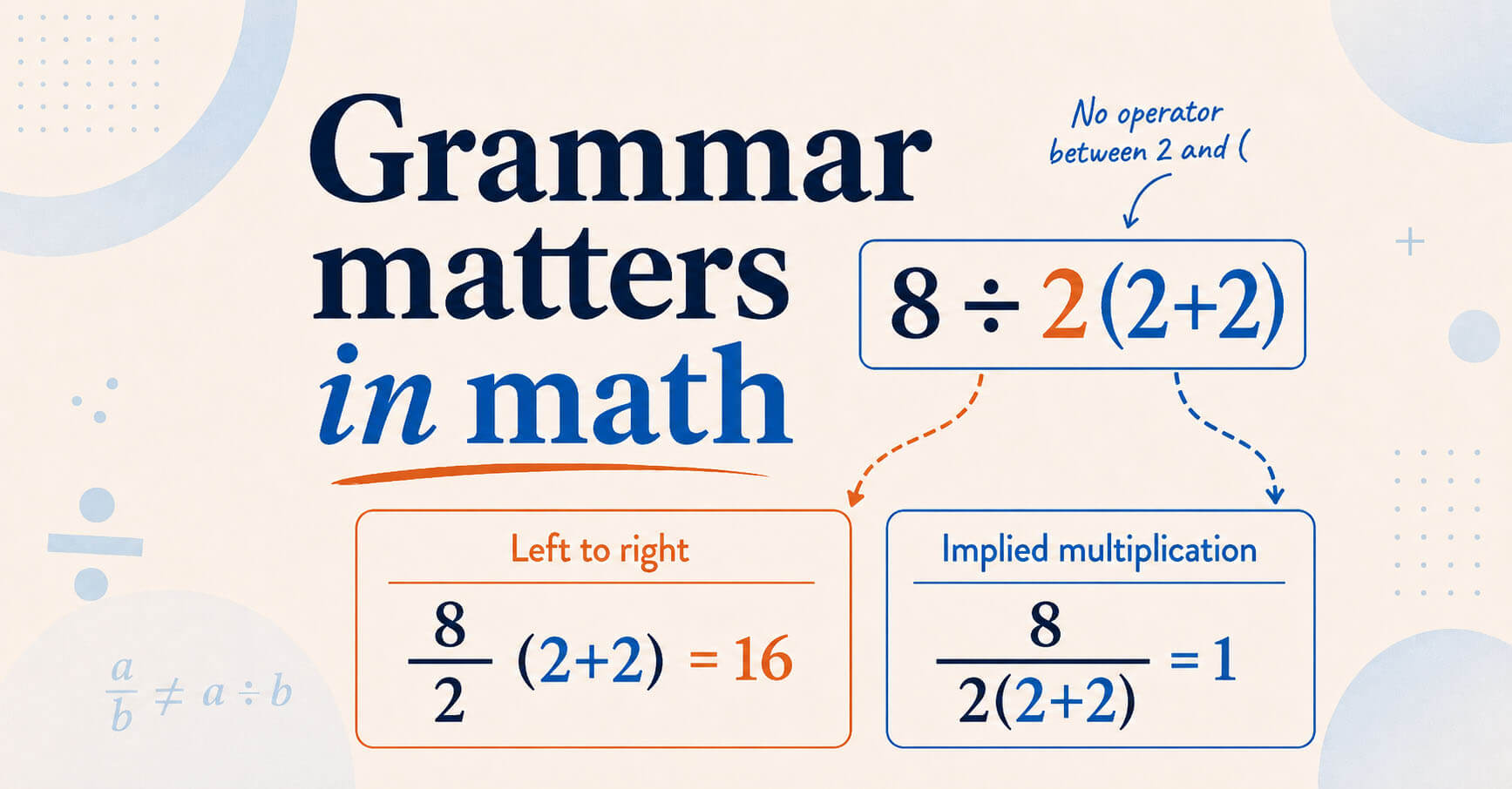
The viral 8 ÷ 2(2+2) debate is not about bad math. It is about ambiguous notation, implied multiplication, PEMDAS, and why math has grammar to sort this out.

Explore AI’s rapid rise, its evolving buzzwords, key branches, the shift from Cognitive Computing to LLMs, and the continued role of rule-based systems.

This article explores how buzzwords originate, their misuse in marketing, the risks they pose, and how to communicate with clarity instead of jargon.
In 2006, Florida voters approved Amendment 3, a significant change to the state constitution that raised the threshold for passing future constitutional amendments from a simple majority to a 60% supermajority. This change was designed to make it more challenging to enact constitutional amendments, ensuring that only proposals with broad public support would succeed. Ironically, […]
I began drafting this article on November 7, 2024, intending to publish my thoughts on the evolving relationship between Elon Musk and the incoming administration. However, life and other projects delayed my edits until January 2025. In that short time, several predictions have already started to take shape. Most notably, Elon Musk is unofficially listed […]
Language is dynamic and multifaceted it influences all forms of communication (verbal, non-verbal, written, etc.), and it is a powerful means of expression that transcends geographical borders, regions, countries, and continents. While it is true that languages can have variants based on location, it’s important to understand that a language itself is not determined by […]
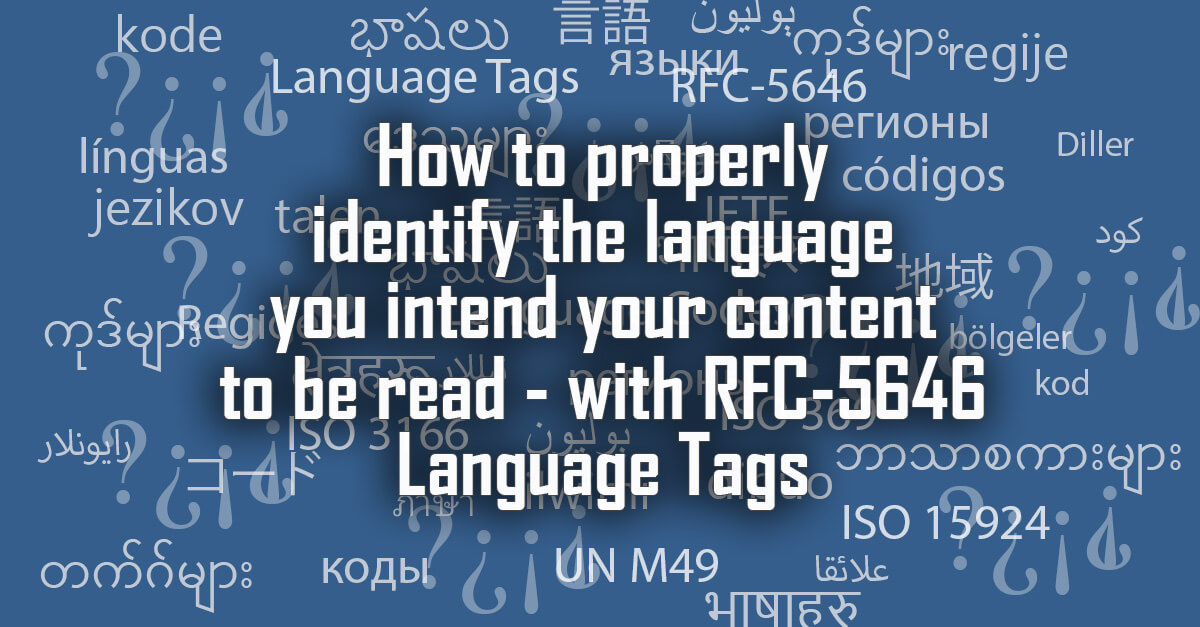
Understand IETF RFC 5646 language tagging significance – a structured system revolutionizing web language identification enhancing accessibility, SEO and user-experience.
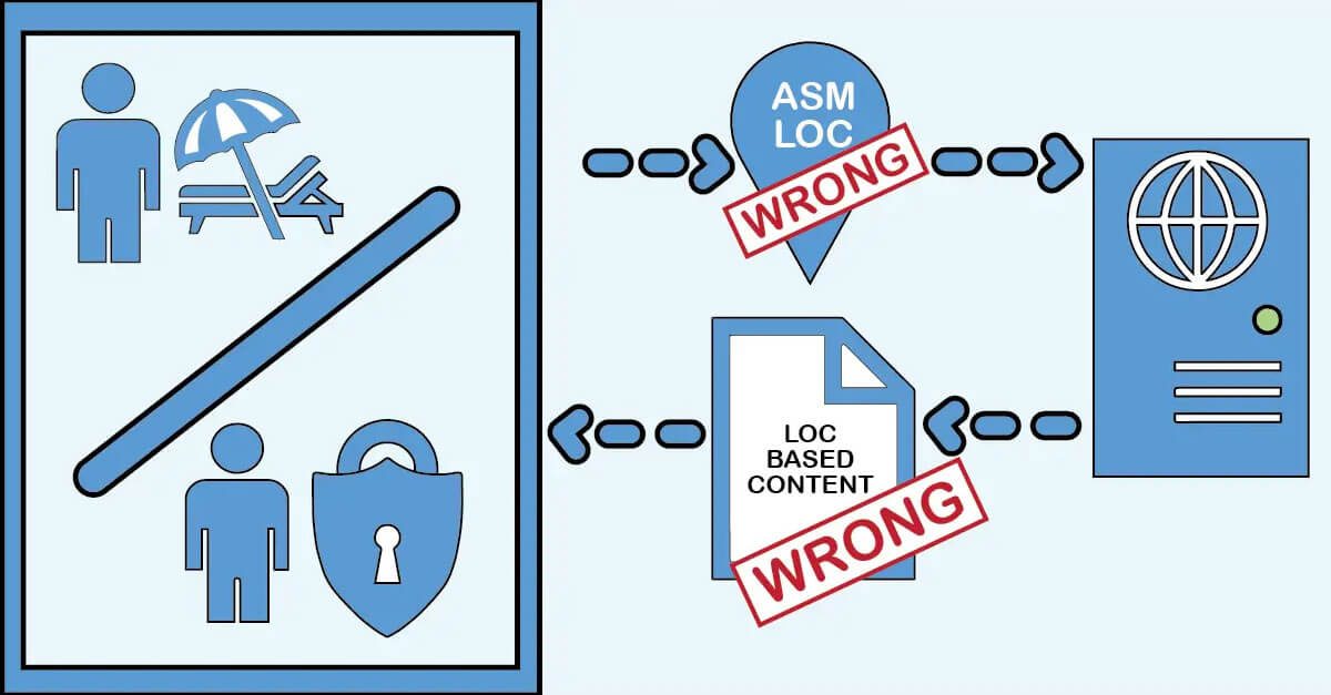
It’s not uncommon for clients to express a desire to utilize personalization techniques to dynamically alter the language or content of a webpage based on the user’s detected location. In this article though we explore why that is not ideal and what we should be telling our clients to do instead.
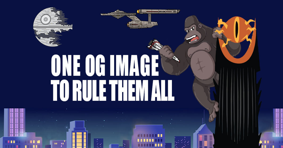
For almost a decade now I have followed Garrett Heath’s advice on formatting social media images but maybe it is time for a change. In this article I go over my own testing and conclusions on resolution sizes and ratios to use for OG Images.
MS Teams allows you to add links to a tab but only secure links. In this article I explain how you can bypass that limitation.