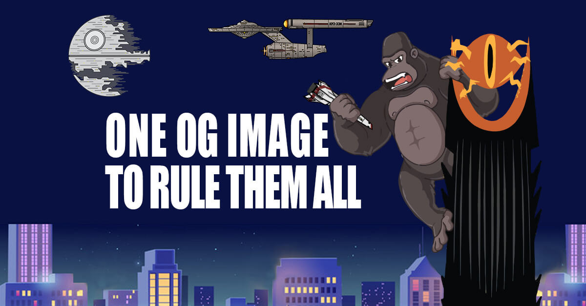
For almost a decade now I have followed Garrett Heath’s advice on formatting social media images. I have always loved his Social Image Size Specs to Rule Them All article and especially his Single Social Image Size Spec: One Image to Rule Them All article. However, just like so many video games these days get remakes and remasters I felt that the research and the article needed to be re-examined but because I loved the original so much, I had to remake/remaster the feature image from his article for this one.
My motivation
A lot has changed since 2016, heck the Twitter logo changed since I started researching writing this article. So it is not surprising the social media platforms that were around then have changed. For example, in the original article Google Plus is taken into account. Also, there has been more information and testing done on what sizes these platforms expect.
Research prior to testing
Like all competent web developers I googled “og image size” and read the Counducter.com article by Steven van Vessum which mentioned “To make sure that your [OG] images don’t get cropped, stick to a 1.91:1 aspect ratio.” Which made me wonder where they got that info from. then googled “1.91:1 aspect ratio” to see what sites mention this ratio. Which lead me to the Cheat Sheet: Social Media Image Sizes (2022 Specs for Every Network) article by Althea Storm over at Adespresso.com which has tons of information. Ultimately, I figured I should see if I can confirm this information from the horse’s mouth.
Interestingly I did not find that they make a statement about the OG image size but they all mentioned a 1.91:1 image aspect ratio somewhere in their spec recommendations. Meta (Formerly Facebook) recommends a “Ratio: 1.91:1 to 1:1” for image ads. LinkedIn recommends 1.91:1 for the “Aspect ratio for horizontal or landscape” in their Single image ads advertising specifications. Instagram upload recommendation is “an aspect ratio between 1.91:1 and 4:5” Twitter mentions in the Creative ad specs page that image Carousel aspect ratio should be “1.91:1 or 1:1 image assets using a single aspect ratio within one carousel”.
So I wanted to figure out what size in pixels this 1.91:1 aspect ratio is so I went back to the Adespresso.com article which mentions the 1.91:1 aspect ratio 16 times but often says something along the lines of “Supported aspect ratio: 1.91:1 to 1:1” and also gives a ranged image size in pixels. In some places the article indicates that 1200 x 628 pixels is an aspect ratio of 1.91:1. What confused me was then later in the article it says “Facebook event cover photo size: 1200 x 628 pixels” and the tip right under that is “Upload event cover photos at a 2:1 aspect ratio”. Yet in another spot it says “1200 x 627 pixels (1.91:1 aspect ratio)”. The article additionally had an update that says, “LinkedIn custom image size for sharing a link in an update: 1200 x 627 pixels” with the tip under it saying “The custom image should have an aspect ratio of 1.91:1.”
Attempting to understand the unusual 1.91 to 1 ratio
Me being me, I had to understand why there seemed to be a discrepancy on the actual resolution 1.91:1 actually is. Turns out both answers are technically correct depending on rounding. Before rounding we get 1.91:1=1200:628.2722513089 and 1.9138755980861:1=1200:627 but if you round 1200×627 and 1200×628 are both a ratio of 1.91:1. So while both are technically correct we have to consider the fact that pixels on an actual physical screen cannot be a fraction. So that means our ratio is what we should be rounding and not our resolution. Ultimately meaning that 1200×627 is a correct resolution for a 1.91:1 aspect ratio. I stated that correct, a correct resolution and not the correct resolution. In theory you could scale up to 1920×1003 or even 2340×1223 and still be a ratio of 1.91:1. Which may be needed in the future with higher density pixel devices, but for now we can safely assume that 1200×627 is perfectly acceptable for OG images.
Testing Results
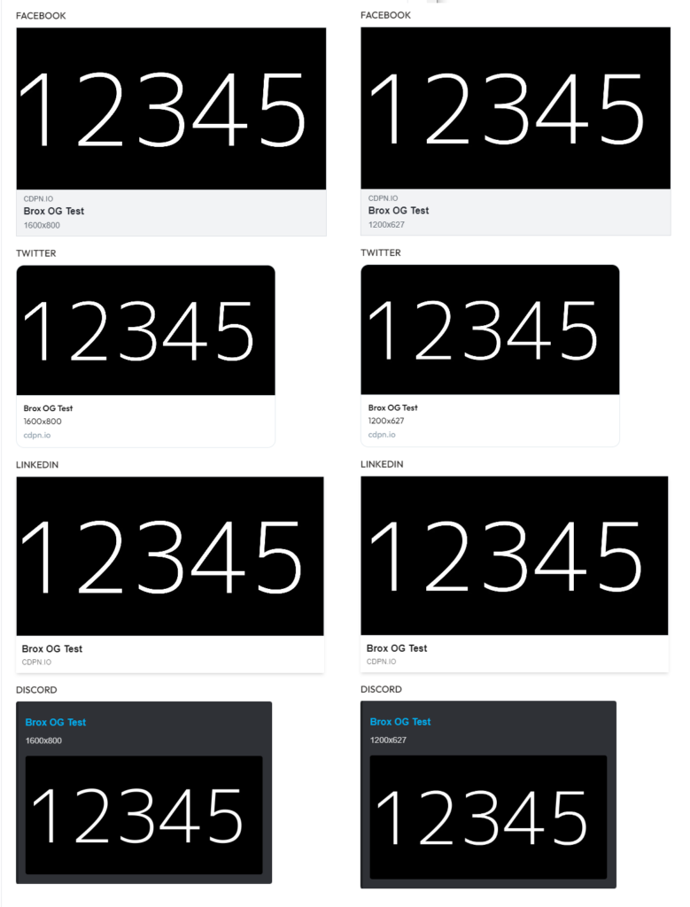
In the left column of tests are the results of me testing the old recommendation of 1600×800 for OG images and in the right column is the new recommendation of 1200×627. While it is hard to see in this example, the numbers are actually closer to the edge than they should be.
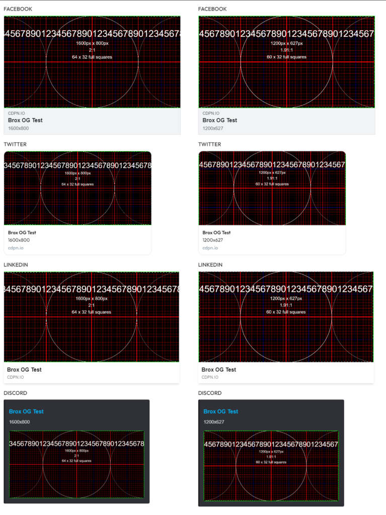
I decided to do another test that would be easier to see if the 1200×627 was truly not being cropped or not. So, I made a new 1600×800 test image and a new 1200×627 test image that both have a green border. Now you can see the test results of the OG images in the left column do not all show the green border on the left and right of the image but the test results in the right column of the OG images all show the green border on all sides of the image. Meaning that an image at 1200×627 or at least 1.91:1 aspect ratio should not get cropped when appearing in social media.
The exception to the rule
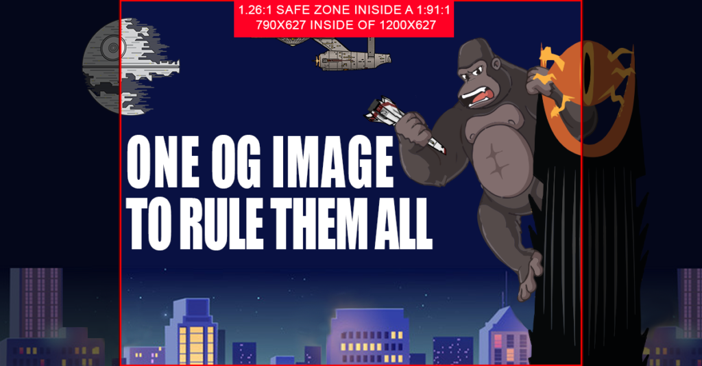
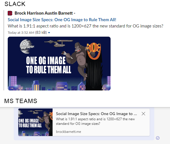
While the focus of the article is how OG images show on social media, I also tested on FB Messenger, Discord, Slack and MS Teams. Of course, it turns out that MS teams has a different aspect ratio. According to Formats for open graph images article on Whatabout.dev MS Teams has an aspect ratio of 4:3. However based on my testing MS Teams uses an aspect ratio of 1.26:1. Also in that article, they have their own recommendation of how to format your OG image by using a square image, but I feel like since the majority of platforms are supporting the 1:91:1 that it should be the primary size an artist would want to account for.
If you want to make sure your OG image looks perfect even in MS Teams then inside of your 1:91:1 image you can make your safe zone for text be 1.26:1. So in the case of a resolution of 1200×627 then your safe zone would be 790×627.
Conclusion
So do you need to change ALL your OG images to a different resolution if you were using the old recommendation of 1600×800? No but moving forward it might make more sense to use a resolution where you do not have to worry about the possibility of the image being cropped on social media sites.
As of August 1st, 2023 I can confidently say that I recommend OG images be a resolution of 1200×627 and if you care about MS Teams then keep your important information within 790×627 of that image. And I will try to keep this article updated when things change.
